| Old Look
Night Shade Theme | New Look, Dusk Theme
(closest to old theme) |
| Inbox view | 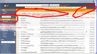
- 5 color theme really nice.
- Text labels are easy to see, and have more functions.
- Easy to see which folder I'm in.
- Orange border around entire inner content small touch but really easy on the eyes, softens the hard edge created by contrast dark slate against white.
| 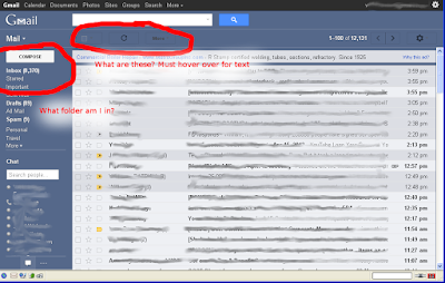
- Can't tell what folder I'm in, I like the old way indicating with backing color
- Icons suck, should be text, or option for text.
- Additionally, the black icons against a dark blue bg are hard to see.
- Functions removed from text list, or require more clicks.
- Harsh edges created.
|
| Compose/Reply view | 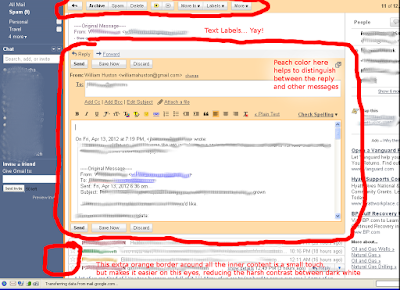
- Text labels are preferred
- Like how the peach color distinguishes the reply from the rest.
- Orange outline around main content softens harsh edge
| 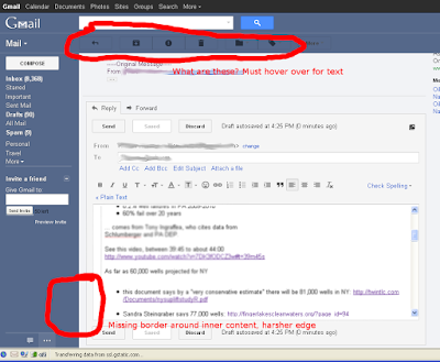
- Blech. Weird icons. Give me text labels, please.
- Additionally, the black icons against a dark blue bg are hard to see.
- Harsh edge.
- Less color contrast, reply gets lost in a sea of white.
|
Update Dec 2012:
I have just started playing with the
Stylish plugin to Mozilla Fox. It allows you to override a site's stylesheed on a per-site basis. There seems to be a good number of user-defined themes at
http://userstyles.org/I am delighted to find a "Nightshade" theme, and it's pretty close!
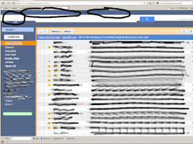 |
| Stylish plugin to Mozilla Firefox, "gmail-b2b" + "Nightshade" theme |
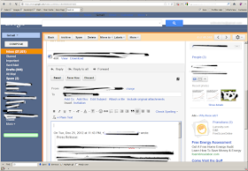 |
| Stylish plugin to Mozilla Firefox, "gmail-b2b" + "Nightshade" theme, compose view |
Now if the author could add the colored box around the response in the composer/reply window,
I think we'd have a winner!


yes! yes! yes! i have been using the same themes and this is exactly what bothers me about the new look. thank you for describing so succinctly.
ReplyDeletenow, if only the dolts in mt.view would listen and look at the firestorm this change has created, they may give us the option to keep the old look.
wishful thinking...
Want me to be in your debt forever? Tell me how to switch my Gmail accounts back to the old version. I'm so disgusted with their new "better design" they're forcing on people I can't spend 5 minutes in my inbox without wanting to throw my laptop at a wall.
ReplyDeleteNote to Google product engineers: It's NOT better. It's clunky, confusing, inefficient, buggy and there was NO REASON to change anything in the first place!
Well crap. I switched to the "new look" in order to describe how to do it, but it looks like they've removed the option. You can no longer go back.
ReplyDeleteThis comment has been removed by the author.
ReplyDeleteI also don't like the new "design". Why Google don't adopt the old designs and let the users the choice what kind of look they want?
ReplyDeleteAll who want to change back, this article describes in german: http://www.foxload.com/2011/11/04/neues-design-fur-gmail-altes-google-mail-wiederherstellen/
Have a look at the last comment, with Stylish and a Userstyle, you can move back if you are using Firefox.
This comment has been removed by the author.
ReplyDeleteThree days ago the removed the old look permanently for me, and then I found this blog.
ReplyDeleteTo days ago I found this:
techably.com/make-gmail-older-look-permanent
that links to: the-return-of-old-gmail
where I started this forum thread:
Old Look "Night Shade" Theme
If you know anything about CSS, please feel free to contribute!
The bringing back of the "Old Look Night Shade Theme" is just about to start...